
From Novice to Pro: Essential Graphic Design Skills for Beginners
Contents
- 1 Understanding the Foundation: Core Principles of Graphic Design
- 2 Mastering the Tools: Essential Software for Graphic Designers
- 3 Typography: The Art of Speaking Through Letterforms
- 4 Color Theory: Painting with Purpose and Emotion
- 5 Composition and Layout: Structuring Your Visual Narrative
Understanding the Foundation: Core Principles of Graphic Design
Before embarking on the journey from novice to pro, it is important to understand the fundamental building blocks of graphic design. These principles, much like the foundational planks of a house, provide the structure and stability upon which all effective visual communication is built. Ignoring them is akin to constructing a dwelling without a solid base—it may stand for a while, but it will ultimately be unstable and prone to collapse. Mastering these concepts allows you to move beyond simply arranging shapes and colors and instead imbue your work with intent, clarity, and impact.
The Role of Balance and Symmetry
Balance in graphic design refers to the distribution of visual weight within a composition. This weight is not determined by physical mass but by how elements attract the viewer’s eye. Achieved through the careful placement of shapes, colors, textures, and typography, balance creates a sense of equilibrium and stability. An unbalanced composition can feel jarring and unsettling, causing the viewer to instinctively feel that something is “off,” even if they cannot articulate why.
Symmetrical Balance (Formal Balance)
Symmetrical balance occurs when elements are arranged equally on either side of a central axis, either horizontally or vertically. This creates a sense of order, formality, and stability. Think of a perfectly mirrored reflection; the left and right sides are identical. While often perceived as static, symmetrical balance can be highly effective for conveying authority and trustworthiness. However, overuse can lead to predictability.
Asymmetrical Balance (Informal Balance)
Asymmetrical balance is achieved by distributing elements of varying visual weights in such a way that they still achieve equilibrium. For instance, several smaller, lighter elements on one side of a composition can balance a large, dark shape on the other. This type of balance is more dynamic and engaging, offering a greater sense of movement and visual interest. It requires a more complex understanding of how different elements contribute to the overall visual weight.
Radial Balance
Radial balance occurs when elements radiate outwards from a central point. This creates a strong focal point and can be effective for designs that aim to draw attention to a central theme or element, such as a logo or a call to action.
The Power of Contrast
Contrast is the juxtaposition of dissimilar elements to create visual interest and highlight key information. It is the engine that drives attention and guides the viewer’s eye through a design. Without contrast, a design can become monotonous and difficult to read, much like a room with all the lights at the same dim level—nothing stands out. Contrast can be achieved in numerous ways, and its skillful application is a hallmark of professional design.
Value Contrast (Lightness and Darkness)
The difference between light and dark elements is perhaps the most fundamental form of contrast. High-value contrast, such as black text on a white background, significantly improves readability. Lower value contrast can be used to create subtler distinctions or to evoke specific moods.
Color Contrast
Opposing colors on the color wheel, like blue and orange, create strong visual contrast. Utilizing complementary colors can make elements pop and grab attention. Conversely, analogous colors (colors next to each other on the wheel) create less contrast and a more harmonious feel.
Size Contrast
Varying the sizes of elements immediately draws attention to the larger or smaller items, depending on the desired effect. A large headline against smaller body text, for example, clearly signals hierarchy.
Shape Contrast
Juxtaposing geometric shapes with organic ones, or sharp angles with soft curves, can introduce visual intrigue and dynamism.
Typography Contrast
Contrasting different typefaces (e.g., a serif font with a sans-serif font) or different weights of the same typeface (e.g., bold versus regular) effectively separates information and adds visual interest to text-heavy designs.
The Importance of Hierarchy
Hierarchy in graphic design is the systematic arrangement of visual elements according to their importance. It’s about guiding the viewer through the information in a logical and digestible manner. Like a clear road map, a well-defined hierarchy ensures the viewer reaches their destination without feeling lost or overwhelmed. Without it, your audience may struggle to find the critical information you intend to convey.
Establishing Dominance
The most important element in a design should be the most dominant, commanding the viewer’s immediate attention. This is often achieved through size, color, placement, or typography.
Guiding the Eye
Subsequent elements should be arranged in descending order of importance, with clear visual cues that lead the viewer’s eye down the hierarchy. This can involve the consistent use of size, spacing, and layout.
Creating Visual Flow
Hierarchy contributes to a satisfying visual flow, ensuring that the viewer moves through the design smoothly and understands the relationships between different pieces of information.
Mastering the Tools: Essential Software for Graphic Designers
While principles are the theoretical bedrock, practical application requires proficiency in specific software. These tools are the artist’s brush and the sculptor’s chisel; they are the means by which your creative vision is translated into a tangible digital form. A novice must dedicate time to learning the intricacies of these applications to effectively bring their ideas to life.
Vector Graphics Editors
Vector graphics are based on mathematical equations and are infinitely scalable without losing quality. This makes them perfect for logos, illustrations, and icons that require usage at multiple sizes.
Adobe Illustrator
Adobe Illustrator is the industry standard for creating vector graphics. It offers a comprehensive suite of tools for drawing, path manipulation, typography, and complex illustrations. Understanding its Bezier curves, pen tool, and pathfinder operations is crucial.
Affinity Designer
Affinity Designer is a powerful and more affordable alternative to Illustrator, providing a unified design environment for vector and raster graphics. It features a robust set of vector tools and is known for its responsive performance.
Inkscape
Inkscape is a vector graphics editor that is both free and open-source. While it may have a steeper learning curve for some, it offers a wide range of functionalities comparable to paid alternatives, making it a valuable tool for those on a budget.
Raster Graphics Editors
Raster (or bitmap) graphics are composed of pixels. They are ideal for editing photographs and creating detailed digital paintings, but they lose quality when scaled up.
Adobe Photoshop
Adobe Photoshop is the undisputed leader in raster image editing and manipulation. This software is essential for photo retouching, compositing, digital painting, and creating complex visual effects. Mastering its layers, masks, selection tools, and adjustment layers is paramount.
Affinity Photo
Affinity Photo is a formidable rival to Photoshop, providing sophisticated photo editing and retouching features. It boasts an intuitive interface and powerful features for both photographers and graphic designers.
GIMP (GNU Image Manipulation Program)
GIMP is a free and open-source raster graphics editor. Similar to Inkscape in the open-source realm, GIMP provides extensive image editing and manipulation tools, making it a viable option for beginners and professionals alike.
Layout and Publishing Software
These programs arrange text and images for multi-page documents like brochures, magazines, and books.
Adobe InDesign
The industry standard for page layout and digital publishing. It excels at combining text, graphics, and images for professional print and digital publications. Proficiency in InDesign is crucial for anyone involved in editorial design.
Affinity Publisher
A robust and more affordable option for desktop publishing. It integrates seamlessly with Affinity Designer and Affinity Photo, creating a powerful ecosystem for document design.
Typography: The Art of Speaking Through Letterforms
Typography is more than just choosing a font; it is the art and technique of arranging type for readability, clarity, and aesthetic appeal. The typeface you select and how you use it can fundamentally alter the message and tone of your design. It’s the voice of your visual communication, and learning to use it effectively is akin to learning to speak eloquently. Poor typography can make even the most brilliant visual concept fall flat.
Understanding Typefaces and Fonts
The distinction between typeface and font, while often blurred, is important. A typeface is the design of the letterforms (e.g., Helvetica). A font is a specific weight, style, and size of that typeface (e.g., Helvetica Bold 12 pt).
Serif vs. Sans-Serif Fonts
Serif fonts have decorative strokes (serifs) at the ends of letterforms, often conveying a sense of tradition, authority, or elegance (e.g., Times New Roman). Sans-serif fonts lack these strokes and are generally perceived as modern, clean, and direct (e.g., Arial).
Display Fonts
These are decorative or highly stylized fonts intended for large use, such as headlines or logos, and are generally not suitable for body text due to their limited readability.
Principles of Typographic Arrangement
Beyond choosing a typeface, how you arrange type elements significantly impacts readability and aesthetics.
Leading (Line Spacing)
The vertical space between lines of text. Proper leading ensures that lines of text do not feel overcrowded, improving readability. Too little leading can make text feel cramped; too much can make it feel disconnected.
Kerning
The adjustment of space between specific pairs of letters to improve visual appeal and readability. Certain letter combinations, like “WA” or “To,” require manual kerning to achieve uniform spacing.
Tracking
The overall adjustment of space between characters in a block of text. Tight tracking can make text appear dense, while loose tracking can make it feel airy.
Alignment
The arrangement of text relative to a margin. Left alignment (ragged right) is commonly used for readability in English. Center alignment can be used for headings or short lines but can be difficult for extended text. Right alignment (ragged left) is less common for left-to-right languages. Justified alignment creates straight edges on both sides but can create distracting “rivers” of white space within the text.
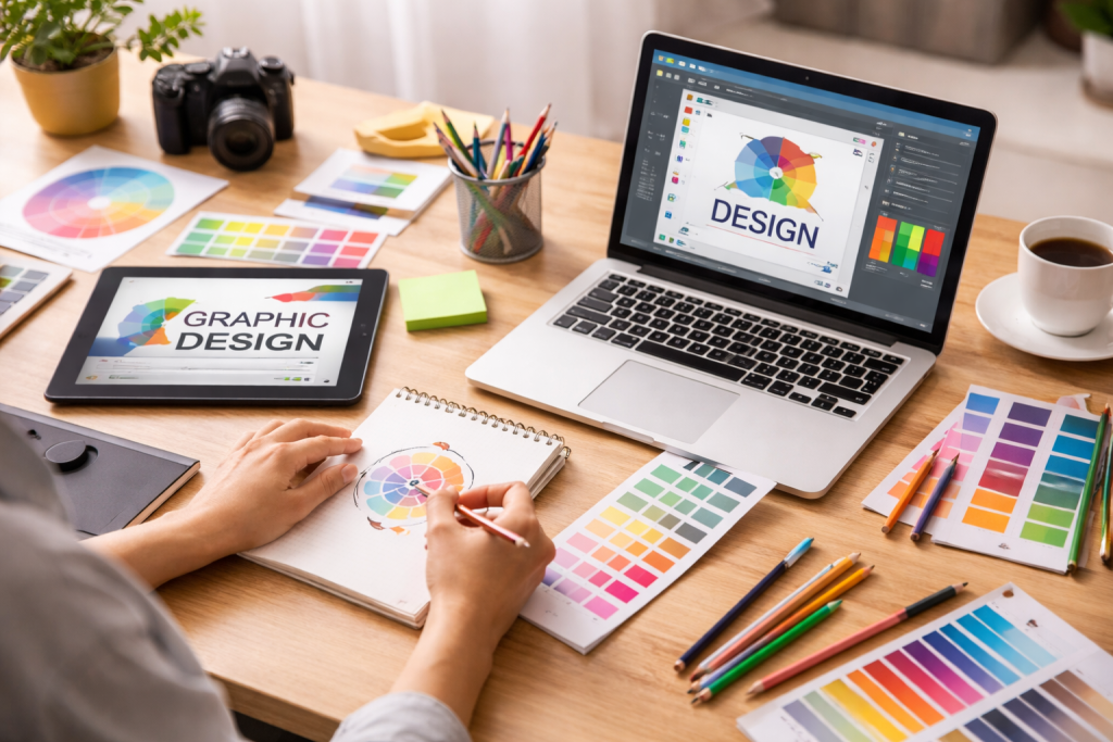
Color Theory: Painting with Purpose and Emotion
Color is a powerful psychological tool in graphic design. It can evoke emotions, convey meaning, and attract attention. Understanding color theory allows you to intentionally wield this power, transforming your designs from mere arrangements of hues into impactful visual experiences. Color is the emotional palette of your design.
The Color Wheel as a Guiding Star
The color wheel is a fundamental tool for understanding color relationships and harmonies.
Primary Colors
Red, yellow, and blue are the foundational colors from which all others can theoretically be mixed.
Secondary Colors
Orange, green, and violet, created by mixing two primary colors.
Tertiary Colors
Created by mixing a primary and a secondary color.
Color Harmonies for Effective Palettes
Color harmonies are combinations of colors that are pleasing to the eye and create a sense of balance.
Complementary Colors
Colors directly opposite each other on the color wheel (e.g., red and green). They create high contrast and vibrant energy but should be used carefully to avoid visual strain.
Analogous Colors
Colors that are next to each other on the color wheel (e.g., blue, blue-green, and green). They create a harmonious and calming effect.
Triadic Colors
Three colors evenly spaced around the color wheel (e.g., red, yellow, and blue). They offer a balance of contrast and harmony, creating vibrant and engaging palettes.
Monochromatic Colors
Variations in lightness and saturation of a single hue. This creates a sophisticated and cohesive look.
Color Psychology and Meaning
Colors carry inherent psychological associations and cultural meanings.
Warm Colors (Reds, Oranges, Yellows)
Often evoke feelings of energy, passion, warmth, and excitement.
Cool Colors (Blues, Greens, Purples)
Tend to convey calmness, serenity, trust, and professionalism.
Neutral Colors (Black, White, Gray, Brown)
Provide a sense of stability, sophistication, and balance. They can act as a backdrop, allowing other colors to stand out.
Composition and Layout: Structuring Your Visual Narrative
| Course Modules | Number of Lessons | Duration |
|---|---|---|
| Introduction to Graphic Design | 5 | 2 hours |
| Typography Basics | 7 | 3 hours |
| Color Theory | 6 | 2.5 hours |
| Layout and Composition | 8 | 3.5 hours |
| Image Editing with Photoshop | 10 | 4 hours |
The arrangement of elements within a design, often referred to as composition or layout, is crucial for guiding the viewer’s eye and communicating information effectively. A well-composed design is like a well-told story; it has a clear beginning, middle, and end, leading the audience through the narrative seamlessly. A chaotic layout, conversely, can leave your audience feeling lost and unengaged.
The Rule of Thirds
An imaginary grid divides an image into nine equal parts by two horizontal and two vertical lines. Placing key elements along these lines or at their intersections can create a more balanced and visually appealing composition.
Grids for Structure and Consistency
Grids provide an underlying structure for aligning and organizing elements on a page or screen. They ensure consistency, improve readability, and create a professional appearance.
Column Grids
Used in multi-page documents to divide pages into vertical sections, facilitating the arrangement of text and images.
Baseline Grids
Align text along a consistent horizontal line, improving typographic harmony and readability, especially in large blocks of text.
Negative Space (Whitespace)
The empty or unused space within a design. Far from being wasted space, negative space is a powerful design element that can:
Enhance Readability
Adequate spacing around text and between elements prevents visual clutter and makes information easier to digest.
Create Focus
Negative space can draw attention to specific elements by isolating them from other content, making them stand out.
Convey Sophistication and Elegance
Generous use of negative space often lends a design a clean, modern, and premium feel.
Visual Weight and Emphasis
As discussed in balance, understanding how different elements carry visual weight is crucial for composition. By controlling visual weight, you can emphasize certain elements and de-emphasize others, directing the viewer’s attention to what matters most. This could involve using larger sizes, bolder colors, or strategic placement to make a particular element the focal point.

The LearnZA Team is a group of passionate learners and content creators focused on delivering high-quality, practical knowledge in a simple and easy-to-understand format.